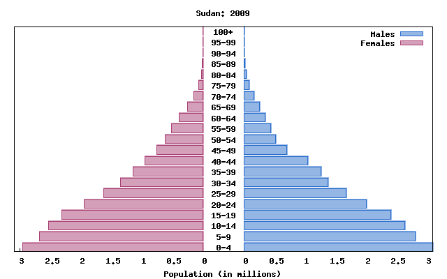
Population pyramids show what percent of a particular population is alive for certain age groups. The left side represents male and the left represents female. this particular map is showing data for Sudan. According to this map it is safe to assume that Sudan has a high fertility rate because the highest percentage their country is living between 0-4 years old. A country that is balanced throughout the age groups likely has low fertility rate as well as low death rates.
No comments:
Post a Comment