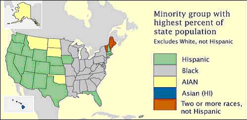
This is a choropleth map showing all the states in America and which minority group has the highest population in each state. When categorizing minority groups through numbers that is nominal data which makes this a nominal choropleth map. In this map it is quite obvious that minorities move where their race is.
No comments:
Post a Comment