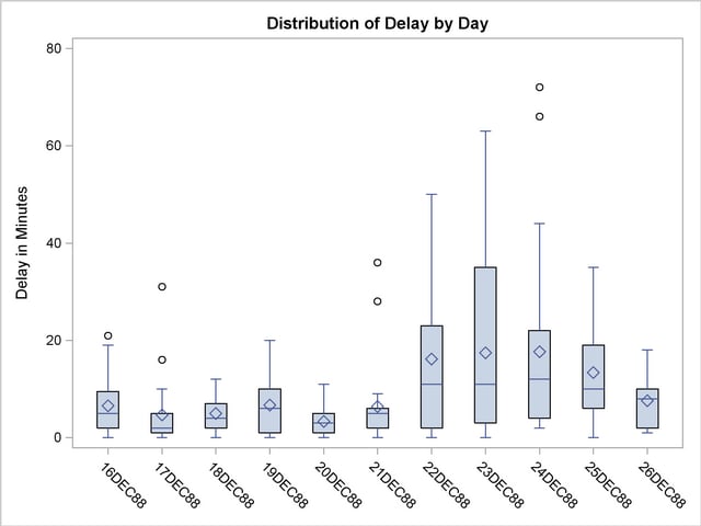
A box plot shows the average, the median and where how far the maximum and minimum values go. The graph above gives the different delays in minutes for different output delivery system (ODS) graphics. The bold horizontal line in the box represents the median and the diamond in the box stands for the average. The line that goes vertical upwards is the maximum delay and the line that goes vertical downward is the minimum delay for that ODS graphic.
No comments:
Post a Comment