Friday, April 23, 2010

Index Value Plot


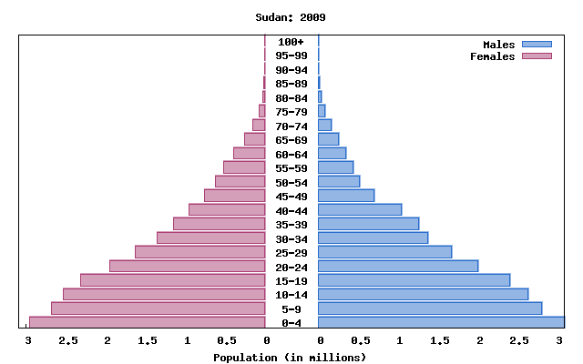
Index value plots pick a certain value to measure variables against. The example above shows the average stream flow index of New Mexico over a ten year period. The stream flow value that was set for normal this example was four. Above four meant New Mexico was too wet and below four was too low.

Correlation Matrix


Correlation matrices are designed to take two variables and show the similarity between the two. There 100% similarity in the diagonal line because you are comparing a variable to itself. You must read below and above the diagonal to see how similar variables are to other variables. The rainbow colored key on the right explains the % of similarity, red being very similar and purple being not alike at all. This example is showing the correlation between 'the cluster moments of electrons.'

Digital Elevation Model


A digital elevation model (DEM) is one that shows the topography of land using remote sensing or land surveying. The model above is a DEM of New Mexico. There key is a key below the map that tells you the elevation of certain areas depending on their color. However, with the DEM it is easy to see the different elevations without a key.

Digital Line Graph (DLG)


A digital line graph (DLG) is a graph that digitally altered in order to show geographic structures more clearly, such as roads, lakes and mountains. The above map was taken of the Lake Tahoe Basin. The red outline is of surrounding roads. You can also see the outline the lake and lines that indicate where streams are going into the lake. DLGs help us to know where geographical features are located.

Continuously Variable Proportional Circle Map


A continuous variable map is one where each circle represents an actual number. It is unlike range-graded in that there can be an infinite number of circles. The graph above is showing the newspaper endorsements that each candidate got in the 2008 election. There are two size circles shown in the key and by that you can see the number of endorsements in each region. These graphs are good when an actual number is known rather than being estimated.

Isopleth


An isopleth is a line that connects points with equal variables. The map here contains several isopleths that are showing the average annual trichloroethylene (TCE) concentrations in Dayhoit, Kentucky. The closer the isopleths are together the stronger the TCE concentrations. Using these isopleths it is obvious to tell exactly where the majority of the concentrations are coming from.

Digital Ortho Quarter Quads (DOQQ's)


A digital ortho quarter quad (DOQQ) is an image that is taken from an Aeriel photo and then digitized. This gives it an accurate scaling. After being tweaked by the computer the image is no longer displaced by the terrain like it was before in the photo. The above photo was taken of lake Wynn, WV.

Light Detection and Ranging (LIDAR)


Light detection and ranging (LIDAR) is a technology that gives a 3-dimensional animation view of a land. It gives an accurate topographical view of an area. The LIDAR taken above is of Manhattan after the 9/11 attacks. These photos helped workers track where the most debris was in order to get the proper equipment to clean up the city.

Doppler Radar


Doppler radar has been a very important tool used in weather forecasting that has helped us to detect thunderstorms and their movements. The Doppler photo in the example is from Hurricane Frances that hit the coast of Florida in 2004. Doppler radar was able to detect this massive storm days in advance of this photo which allowed people in the area to properly prepare. Doppler uses microwave radiation to detect these movements. Doppler radar has been one of the biggest advances in predicting weather.

Black and White Aerial Photo


Black and white ariel photos are usually taken best in a place with little vegetation because when there are a lot of trees in the photo usually shows up in similar shades and is hard to distinguish. This photo was taken in 1920 of Johnstown, Pennsylvania. For a photo taken in that year it is very clear in what the town looks like.

Thursday, April 22, 2010

Infrared aerial photo


Ifrared photos are photos that are displayed in color that aren't real. The wavelenghts of the actual colors can't be seen by the human eye so infrared film turns it into a wavelength we can see. The aerial photo above is taken of South Florida and the red rectangle is around the everglades. Since I haven't studied infrared its hard to say what the pink and white is exactly.

Statisitical map


The map above is a statistical map because it shows the technological statistics of the world. It shows who uses Internet, which appears to be about 90%. About 5% have email only and another 5% have no connectivity. This map is from 1997 so by now the percentage of Internet users is probably higher.

Wind rose plot


Wind rose plots show what percentage of wind cam from what direction in a given place. The one in this example shows the wind direction in Olympia, Washington. About 18% of the wind came from the south. This wind rose also shows the percentage of strength that the wind came in from each direction. For example, 11% of the total wind in Olympia came from the north and 2% of the total wind in Olympia came in from the north between 11-17 knots.

Climograph


Climographs are graphs that compare precipitation and temperature in a given place over a period of time. This example is comparing the two variables in Walgett, Australia over a one year span. The purple line is the temperature during each month, which is represented by the right vertical axis. The blue bars are representing the precipitation (mm) each month, which is given on the left vertical axis. There doesn't seem to be any clear relationship between precipitation and temperature in this climograph.

Similarity matrix


A similarity matrix takes two variables and compares how similar they are to each other by using x and y axes. The matrix in this example takes ten different strains of bacteria, listed 1-10, and compares them to one another. The boxes in black represent 100% similarity because they are relating a particular bacteria to itself. The data is plotted using 7 different intervals, they are all in increments of 10% except of course for the 100% box. None of the bacteria are 90-99% similar according to the data.

Star plot


1
Price
2
Mileage (MPG)
3
1978 Repair Record (1 = Worst, 5 = Best)
4
1977 Repair Record (1 = Worst, 5 = Best)
5
Headroom
6
Rear Seat Room
7
Trunk Space
8
Weight
9
Length
Star plots allow people to compare a number of variables without having to read a number of different graphs or articles about each variable. The star plot above compares sixteen automobiles from 1979 with the nine different variables that are listed. Each variable comes out of the radii from the center. The further it comes out of from the center means the better it is as far as that particular variable is concerned. For example the Buick Electra is great with every variable given except miles per gallon.

Parallel coordinate graph


Parallel coordinate graphs plot numerous information across the horizontal axis and put it all together to create a graph. The graph above plots earthquake data that is centered around the longitude data. From here other data is plotted and connected. This other data includes magnitude, location, latitude, time and the date. Parallel coordinate plot are very useful when dealing with situations that have many variables.

Histogram


Histograms display information through an x-axis and a y-axis. One line has an independent variable and the other has a dependent variable. The histogram above has the dependent variable (the number of students getting a particular grade) on the vertical axis and the independent variable (the actual grade) on the horizontal axis. According to this histogram most students scored between 60% and 80 % and the least amount of students scored from 0% to 20%.

Box plot


A box plot shows the average, the median and where how far the maximum and minimum values go. The graph above gives the different delays in minutes for different output delivery system (ODS) graphics. The bold horizontal line in the box represents the median and the diamond in the box stands for the average. The line that goes vertical upwards is the maximum delay and the line that goes vertical downward is the minimum delay for that ODS graphic.

Stem and leaf plot


Stem and leaf plots are usually done when we are trying to group together a lot of data in a small table. The stems are the numbers in the left column and the leaves are the numbers on the right, each one representing one variable. The plot above is heights taken from a group of adults and n=200 which means that you add 200 to the number in the stem and then put a decimal and then the number in the leaf. This will give you the height in inches of each adult. These plots help to find means, minimums, and maximums for data.

Population pyramid


Population pyramids show what percent of a particular population is alive for certain age groups. The left side represents male and the left represents female. this particular map is showing data for Sudan. According to this map it is safe to assume that Sudan has a high fertility rate because the highest percentage their country is living between 0-4 years old. A country that is balanced throughout the age groups likely has low fertility rate as well as low death rates.

Cartogram


Cartograms are maps that have been altered to help measure the variable being used. This is a map of the 2004 election between John Kerry with the blue states and George Bush with the red states. A lot of the smaller states have large populations and are blue. A lot of the red states are large with smaller populations. This map alters the size of the states so that you don't have to think about population density.

Flow maps


The map that we are focusing on here is the top one which shows China's crude oil trade forecast through a flow map. The arrows in red indicate that China is net importing and the only one in green, with Japan, is the lone net export for China and oil. This indicates that China is in high need for oil and is not producing nearly enough oil to support themselves. This map does not use a desire line as those are mostly used in flow charts that deal with travel rather than import/export.

Isoline map


Isolines are any lines that connect some kind of variable at equal measures. The map above has lines connecting points throughout the United States that have equal wind temperature (isotach). The lowest varibale starts at 10-20 MPH winds. Anything below that wind speed is left in green. The isolines are drawn in different shades of blue.

Proportional circle map


This is a proportional circle map that is showing it's data by using seven different size circles. This map is displaying the number if Internet users throughout Europe using the countries as areal units. The bigger the circle is the more Internet users in that country. This is range-graded as the number of Internet users is put into a specific range.

Range-graded proportional map


This is a proportional circle map because it shows different size circles to display information about different areas. It is range-graded because four sets of circles are used to show the population. This map shows the American Indian population in thirteen different states for the year of 1990.

Dot distribution map

Dot distribution maps use dots to represent a certain variable. Many times these maps are used in showing population because the dots do a good job of showing density because a lot of times in the most dense places the dots all come together. A good example of this is in the Detroit Area above, where the population is so dense you can't tell one dot from another. The above map is showing the high populations around the Great Lakes and is trying to determine if this is the cause for the increased pollution in these lakes.

Unstandardized choropleth map


This map is unstandard in that it shows no aerial average. This is a map from the 2008 election that displays the republican in red and democrats in blue. It does not show population density so just by looking at it people might think that Cheney won when in fact it was a landslide victory for Obama. Many times standardized choropleth maps are used as a tactic to deceive people.

Standardized choropleth map


This is a map of the United States that shows the population of each state based on the size of the state. What makes this map standardized is the fact that it is aerially averaged. What I mean by that is it shows the population of a state basedon it's area. California has the largest population in the United States but you wouldn't know that by looking at this map because states like New york and New Jersey fit more people per area available.

Univariate choropleth map


Univariate maps are very simple in that they display just one variable in the entire map. The map above is of the United States. The one variable that it is mapping is the percentage of people that live in poverty throughout the United States. It does this using five different variables which are displayed in different colors.

Bivariate choropleth map


A bivariate choropleth map maps two different variables and compares them by creating different symbols for each variable. The map above is of Ohio and its areal units are done by county. The first variable is median house value and is shown by how many black dots are displayed in the county. The other variable is 1997 and is shown through color. Both are in interval of four. The purpose of this map is to see if the house value in Ohio counties is linked to the population in the counties.
http://proceedings.esri.com/library/userconf/proc99/proceed/papers/pap171/p171.htm

Nominal area choropleth map


This is a choropleth map showing all the states in America and which minority group has the highest population in each state. When categorizing minority groups through numbers that is nominal data which makes this a nominal choropleth map. In this map it is quite obvious that minorities move where their race is.

Unclassified choropleth map


Unclassified choropleth maps are not put into classes. In other words there are as many intervals as there are areal units. The map above is fertility rates in European countries. Each country has a different fertility rate so they must each have a different shade, which is what I meant by number of intervals equal number of areal units. In this map the maximum fertility rate is 2.27(darkest shade of orange) and the minimum is 1.13(lightest shade of orange.)

Classed choropleth map


This is an example of a classed choropleth map. It is a map of North Carolina and the areal units are the counties. This map is showing methane emissions that resulted from beef cattle in 1992 throughout the state of North Carolina. There are six intervals in this map and it displays most methane emissions are coming from the central part of the state.

Wednesday, April 21, 2010

Lorenz Curve


Lorenz curves are used as an economic tool to determine the distribution of money in a particular region. The 45 degree angle drawn in bold represents 100% equality, meaning that every person makes the same amount of money if you are on that line. The further the curve gets from that line, the more unequal the distribution of money. The example above is showing Scotland's inequality in 2000-2001 compared to 2005- 2006. According to the Lorenz curve Scotland's distribution of money became more equal from 2000- 2006.

Scatter plot


Scatter plots are used in order to compare two variables and see if they have any correlation with each other. In this example the two variables compared were arm strength and grip strength. Many times on scatter plots a 45 degree angle will be drawn on the graph and the less the dots move away from the dots then the more likely the two variables are dependent on each other. In this case it was determined that the more grip strength a person has, the more arm strength they will have as well.

Tuesday, April 20, 2010

Digital Raster Graphic


This map is an example of a digital raster graphic at Emerald State Park located in Lake Tahoe, California. By scanning a topographic map it can now be used digitally like the one above instead of just on paper. This map shows us the elevation of the state park by using contour lines.

Isotachs


This map shows a series of isotachs throughout numerous provinces in Canada. These isotachs display areas of equal wind speed. In this map it shows how Canada's wind speed is the same in NW positions as it travels SE.

Isopach


This is a map of the Bakken Formation which is located in Saskatchewan, Canada. It is considered an isopach map because it shows the depth of rock throughout that area. This map color coordinates areas to help the viewer distinguish. This is helpful in determining whether or not it is financially worth drilling for oil.

Isohyets


This is a map of Australia that uses an isohyet to show where the average rainfall occurs in this country. 300 mm of rain was the average rainfall per year in Australia over a given time. They took every place that received that much and connected them to create the line above that is referred to as an isohyet. Many times in maps they will connect several isohyets to show where the most and least rainfall occurred.

Isobars


Isobars are lines that connect where the atmospheric pressure is equal. In the map above of the United States, if you look where along where the Appalachians are you will see that the lines are very close together. This means that the pressure in this region can change more rapidly. Isobars help us to predict where rainstorms are most likely to occur.

Choropleth Map


Choropleth maps are designed to show how a particular theme is distributed throughout an area. This map was designed to show the significant difference between how Hispanics and Latinos are spread throughout Florida. South Florida counties have a much higher level of Hispanics than do northern counties. Choropleth maps can dramatically change the way they look by adding or subtracting the amount of variables that are given. This particular map has five intervals and I think if you changed it to four it the disparity would be more apparent.
http://my.ilstu.edu/~jrcarter/Geo204/Choro/Tom/

Propaganda Map


This is a propaganda map that shows the continent of Asia. Every country is displayed as a human being except Russia who is portrayed as an octopus and has all eight arms attacking numerous countries. This map was obviously created to promote hatred towards the Russians. Most propaganda maps are used in time of war to create a similar hatred and bias towards a country or group of people.

Topographic Map


This map is an example of a topographic map that shows the relief by using contour lines. This map gives us the vertical distance in numbers. However, if those were not given the way to determine a rise in elevation is the distance the lines are from each other. The closer they get means a more dramatic rise in elevation. This map's lines get close very quickly characterizing a steep land surface.

Hypsometric Map


The image above is a hysometric map of Tajikistan. What makes it a hypsometric map is the different use of colors to show elevation throughout the area. In this map the closer to red a color gets the more elevation it has. This shows that this land increases in elevation the closer you go inland. Hypsometric maps don't have to use color to show changes in elevation, they can also use contour lines and shading.

Planimetric Map


This map is a great example of a planimetric map because it does not give and vertical information to the place it is describing. This map shows numerous things such as roads, bus stops, and storage tanks in a two-dimensional plane. Many planimetric maps are very generalized such as this one as it gives us only essential information as to where things are located in coordinates to eachother. Most road maps are good examples of planimetric maps as well.

Cadastral Map


The above map of the world is an example of a cadastrtal map. It shows the boundaries and land ownership that each country has making it a systematic partitioning land system. This map of the world and other cadastral maps help us to understand where and how big our boundaries are with neighboring areas.

Public Land Survey System Map


This is a map of the state of Indiana. It is a good example of a Public Land Survey System (PLSS) map because it shows the boundaries between counties in the state. This is important in determining things like transportation that are dealt with on a local level. PLSS maps are made by base lines (east and west), principal meridians(north and south), and the initial point that they go through.

Thematic Map


Thematic images, best done when there is equal area (Albers maps), are maps that show a specific theme in an area. This is a map that shows the different types of soil throughout the forty-eight contiguous states. Many times thematic maps use colors to indicate certain characteristics. For instance, in this map red indicates the driest soils in the country. This particular map will help people in the agricultural business find which places are best for growing crops without using artificial watering techniques.

Monday, April 19, 2010

Mental Map http


This is a map of a place called the Great North Road. It is a mental map because it is a person's abstract view of how an actual area looks. This particular map was designed as a result of roads taking over transportation versus the railroads that dominated before. I'm guessing this map was designed to help drivers who had never been so far north as it shows where the roads end and where they must pick up ox.